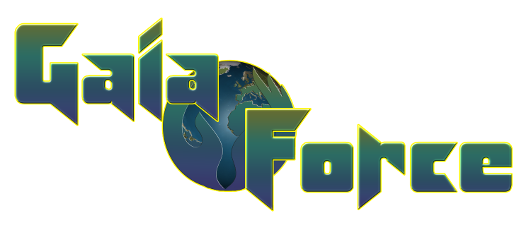
Ideas for the Gaia Force logo
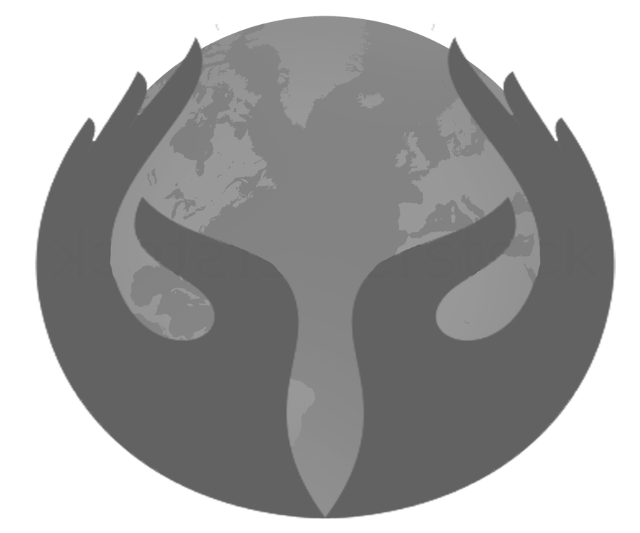
This represents what the original Gaia Force stood for.
It is shows two hands cupping the Earth.
It also looks like two eyes which symbolize watching over the Earth.
It is shows two hands cupping the Earth.
It also looks like two eyes which symbolize watching over the Earth.
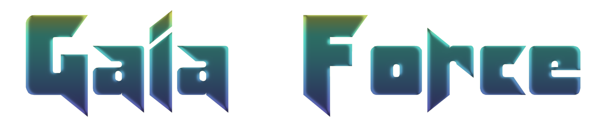
The Gaia Force name is written using the KlingBlade font.
I wish to keep this font, but the colours can be altered and strokes can be added.
I wish to keep this font, but the colours can be altered and strokes can be added.
This could be a possible logo for the series.
I adjusted the distance between the "F" and "O" because they seemed to be too far apart (see above).
I adjusted the distance between the "F" and "O" because they seemed to be too far apart (see above).
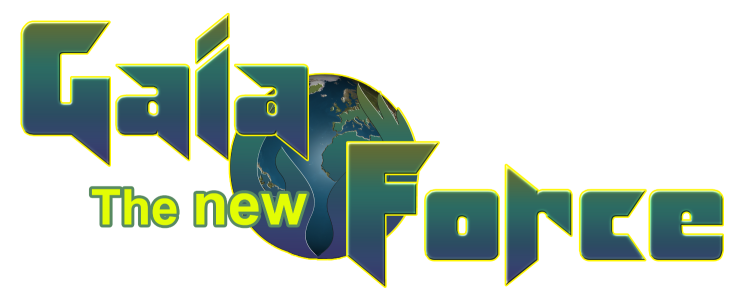
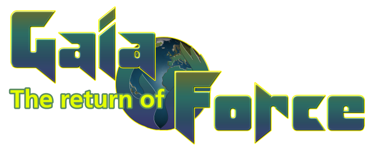
Issues 1 to 6 will read
Future issues will read
Eventually, the sub-text will disappear.